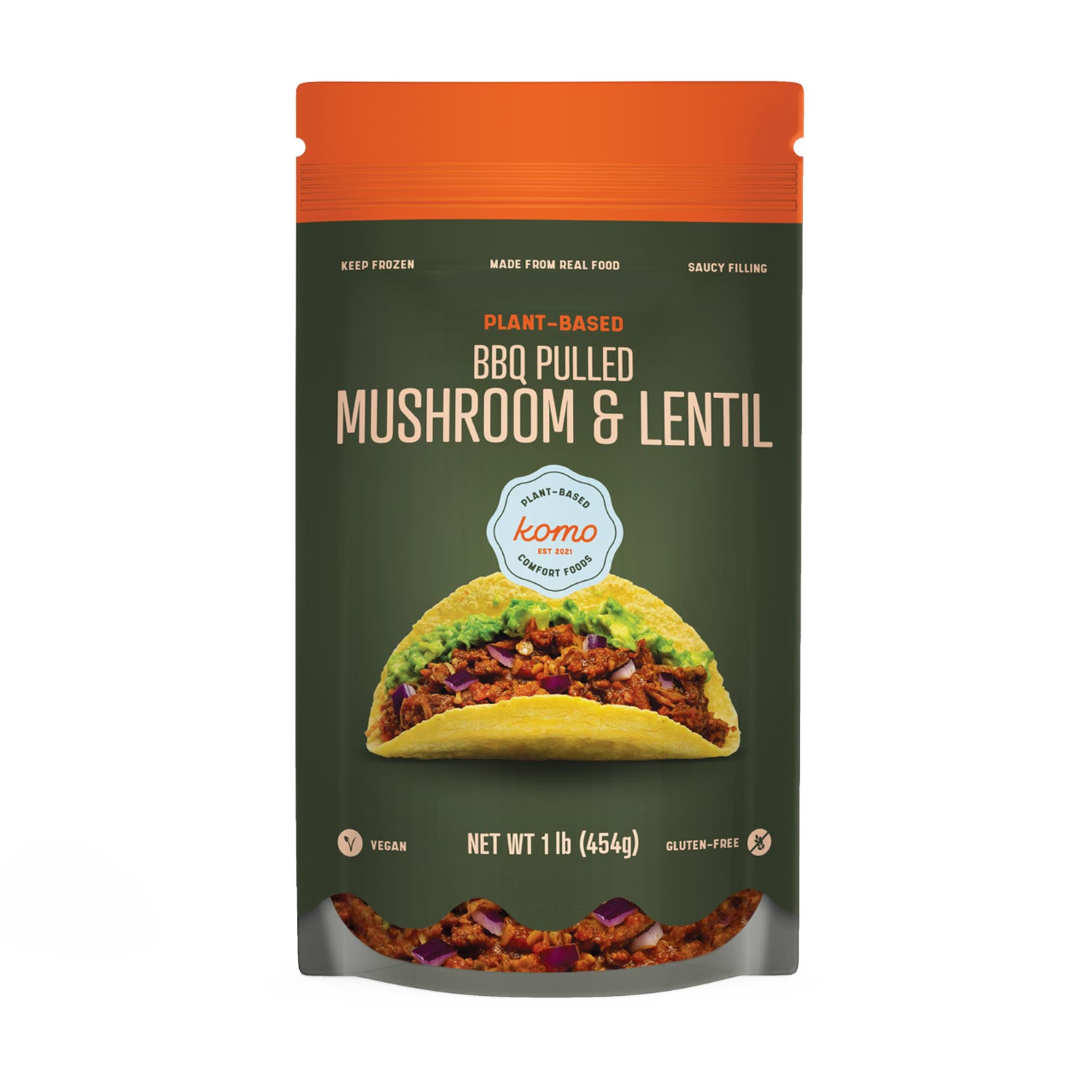
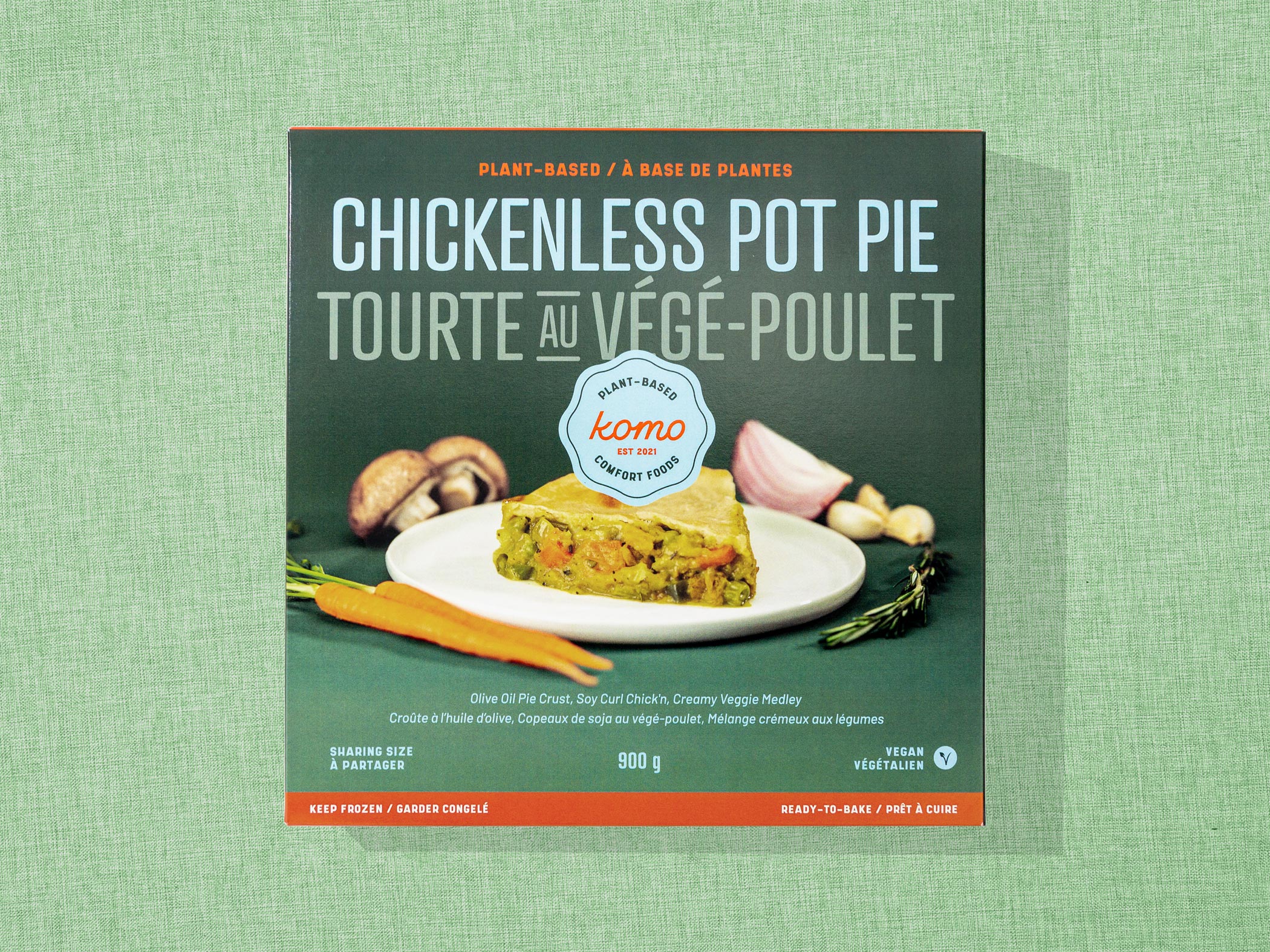
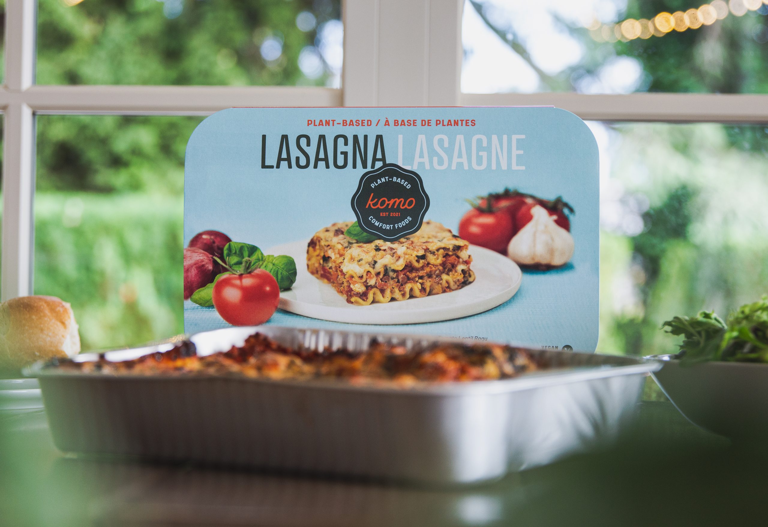
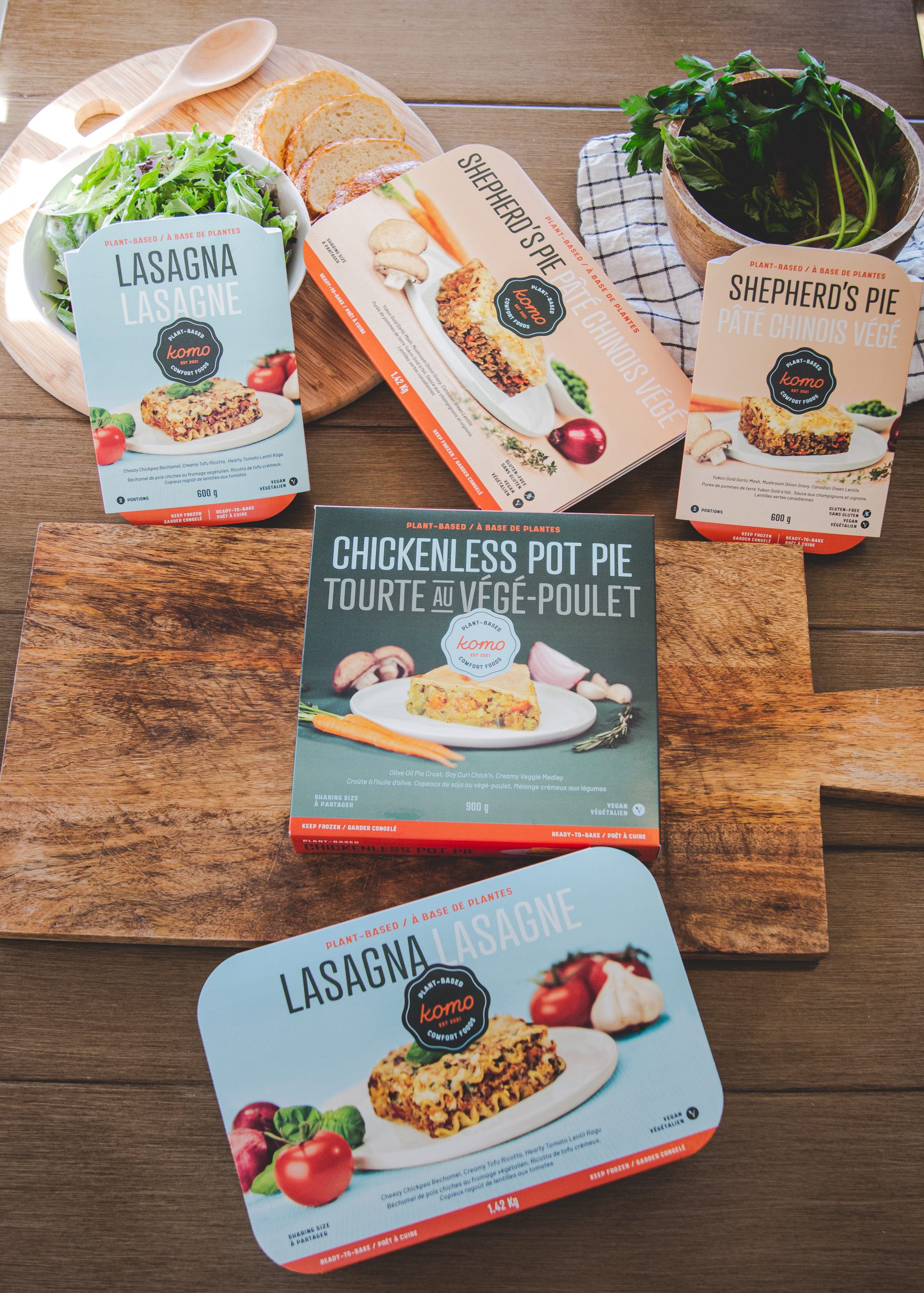
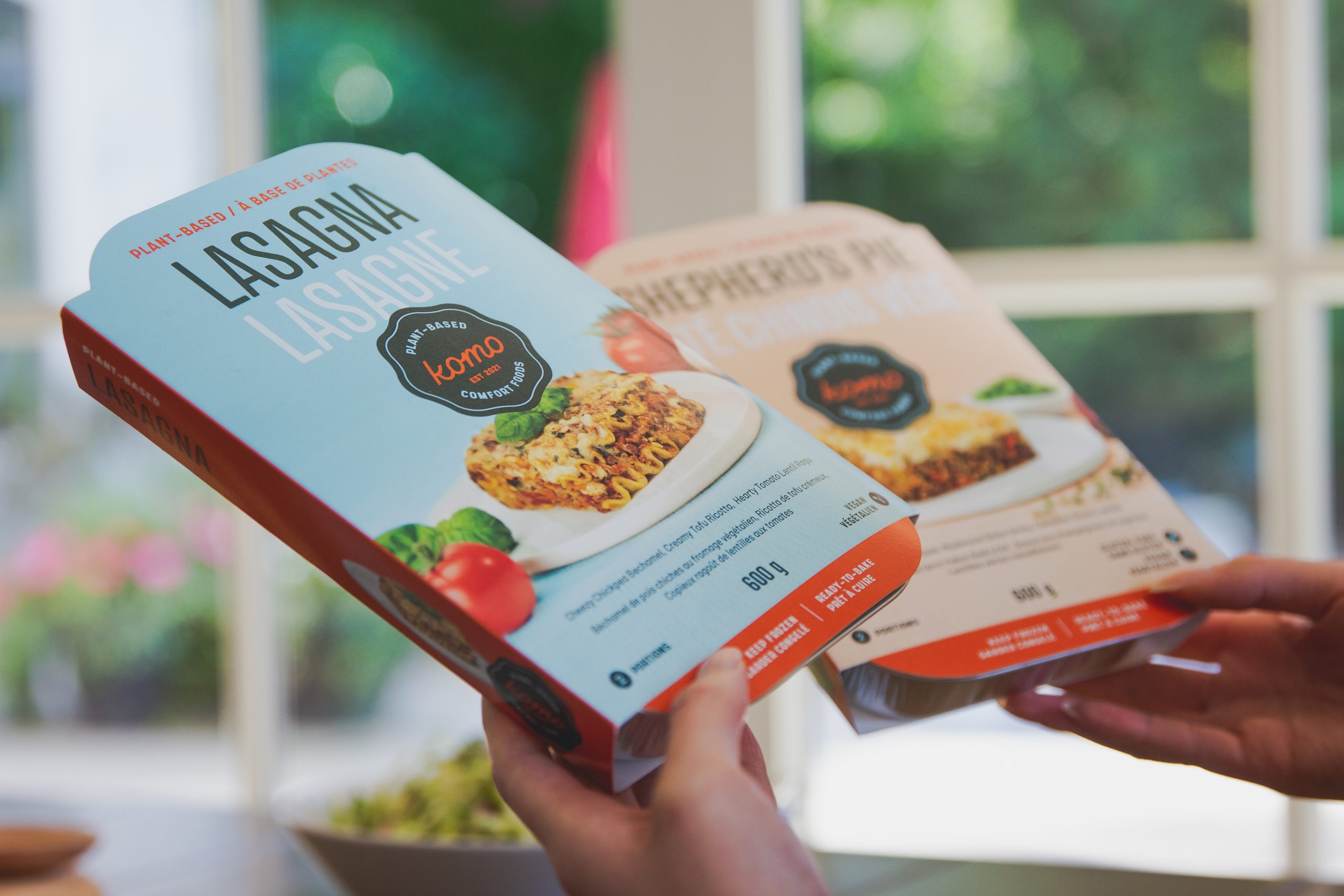
Our challenge as a team was to create a plant-based comfort food brand that evoked a nostalgic reminiscence of family favourite meals such as lasagna, chicken pot pie and shepherds pie. The goal of our client was to replace those usually meat-centric meals with delicious plant-based equivalents that are friendlier to the Earth. We designed the central Komo stamp logo to begin to tie all those elements together with a uniquely ‘owned’ Komo forest green.
PROJECT OVERVIEW
What Was Done
Art Direction, Naming, Brand Development, Packaging, E-commerce Website, Social Media
BRAND DEVELOPMENT
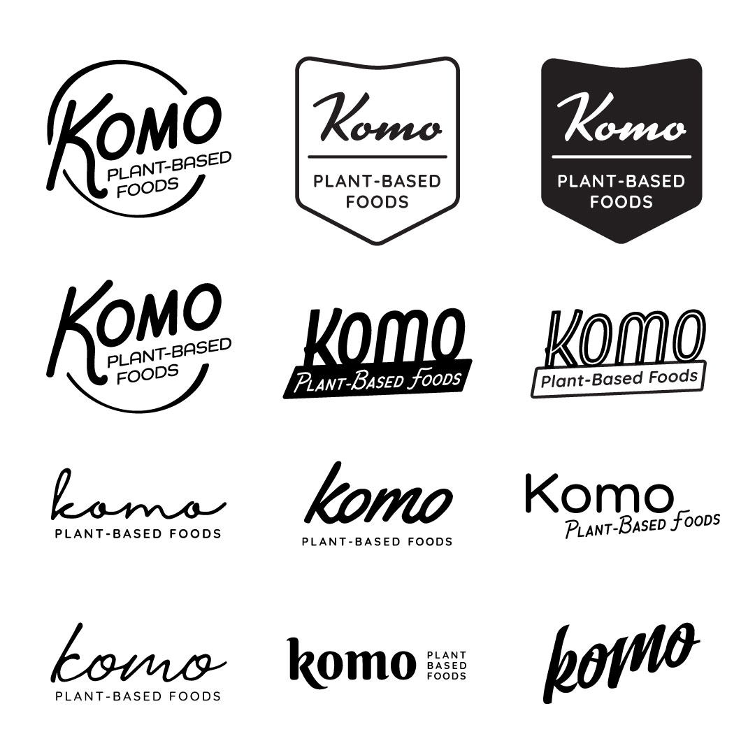
The Komo brand had a couple evolutions before it made it to customers eyes. It began as a plant-based pub food concept before strategically shifting over to a plant-based replacement for comfort food favourites. Here you’ll see a few early concepts that later evolved into the current custom script word mark and stamp logo we use today.
FINAL WORDMARK
& LOGO
A custom script word mark was designed to dial in the combination of nostalgia and the almost sans-serif style creates a modern twist. Added on to that we created the stamp version to feature boldly across all major brand touch points. I worked with our motion graphics artist to create the logo animation reveal tying the growth of plants into the word mark.

MEAL
HELPERS
HELPERS
