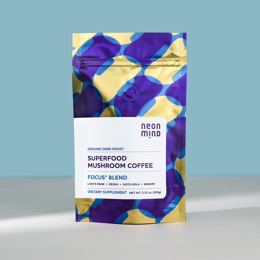
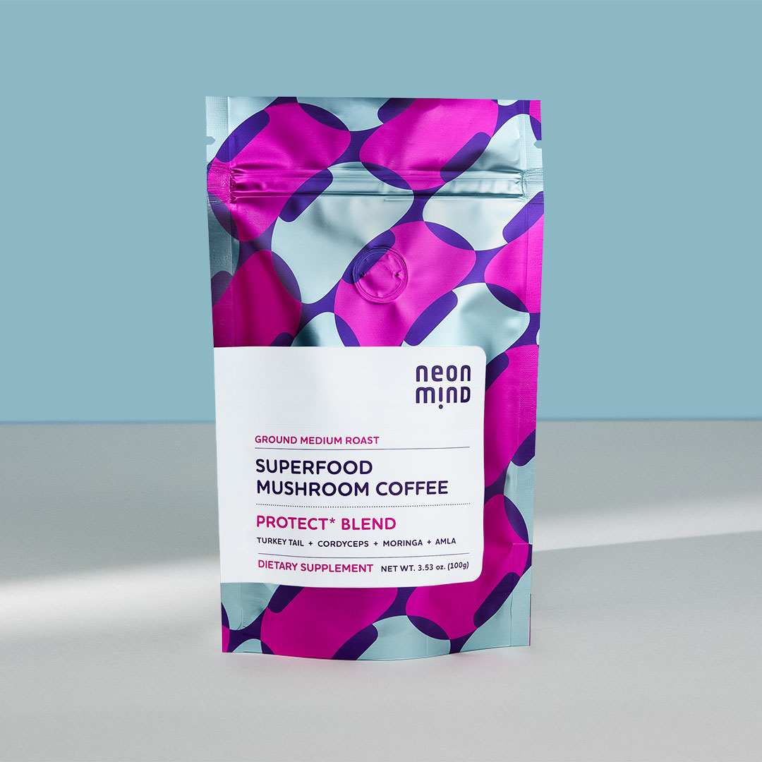
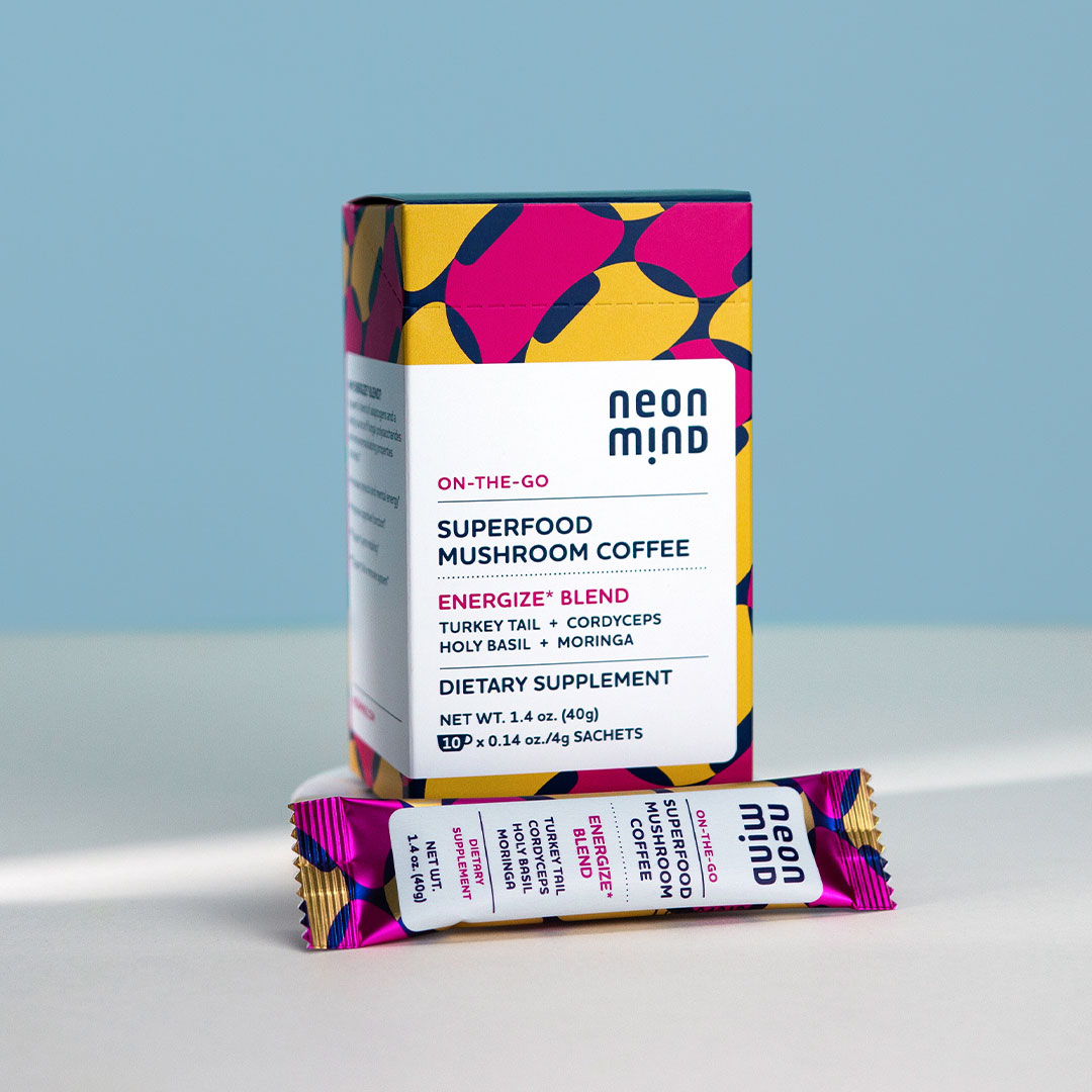
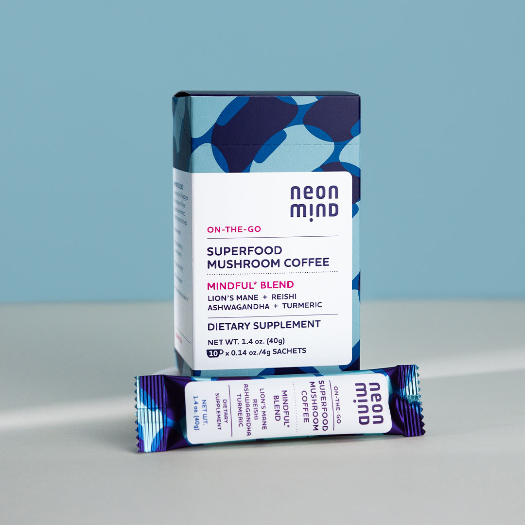
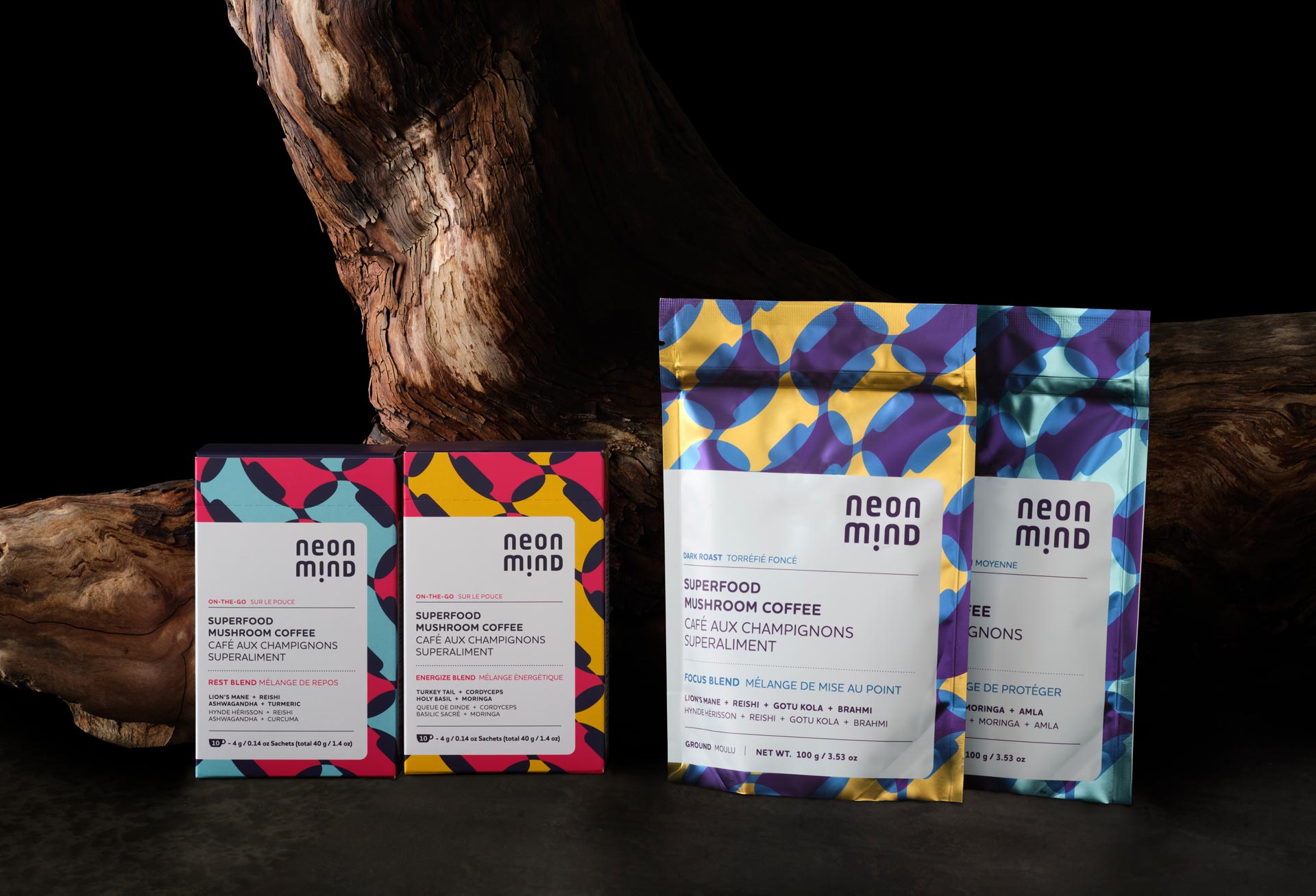
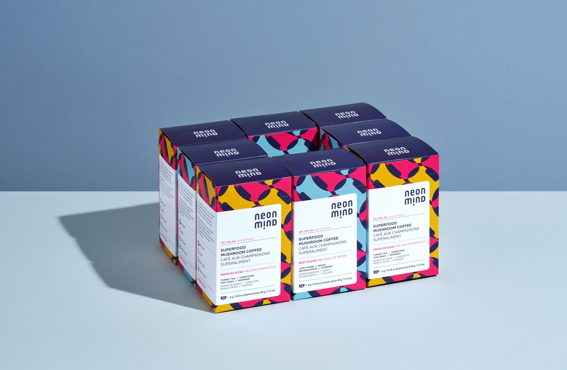
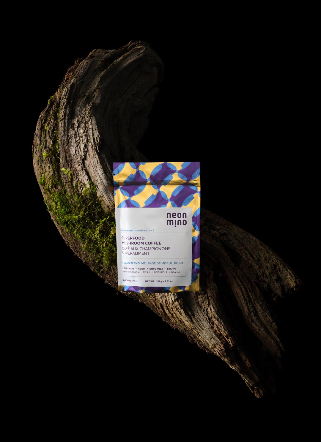
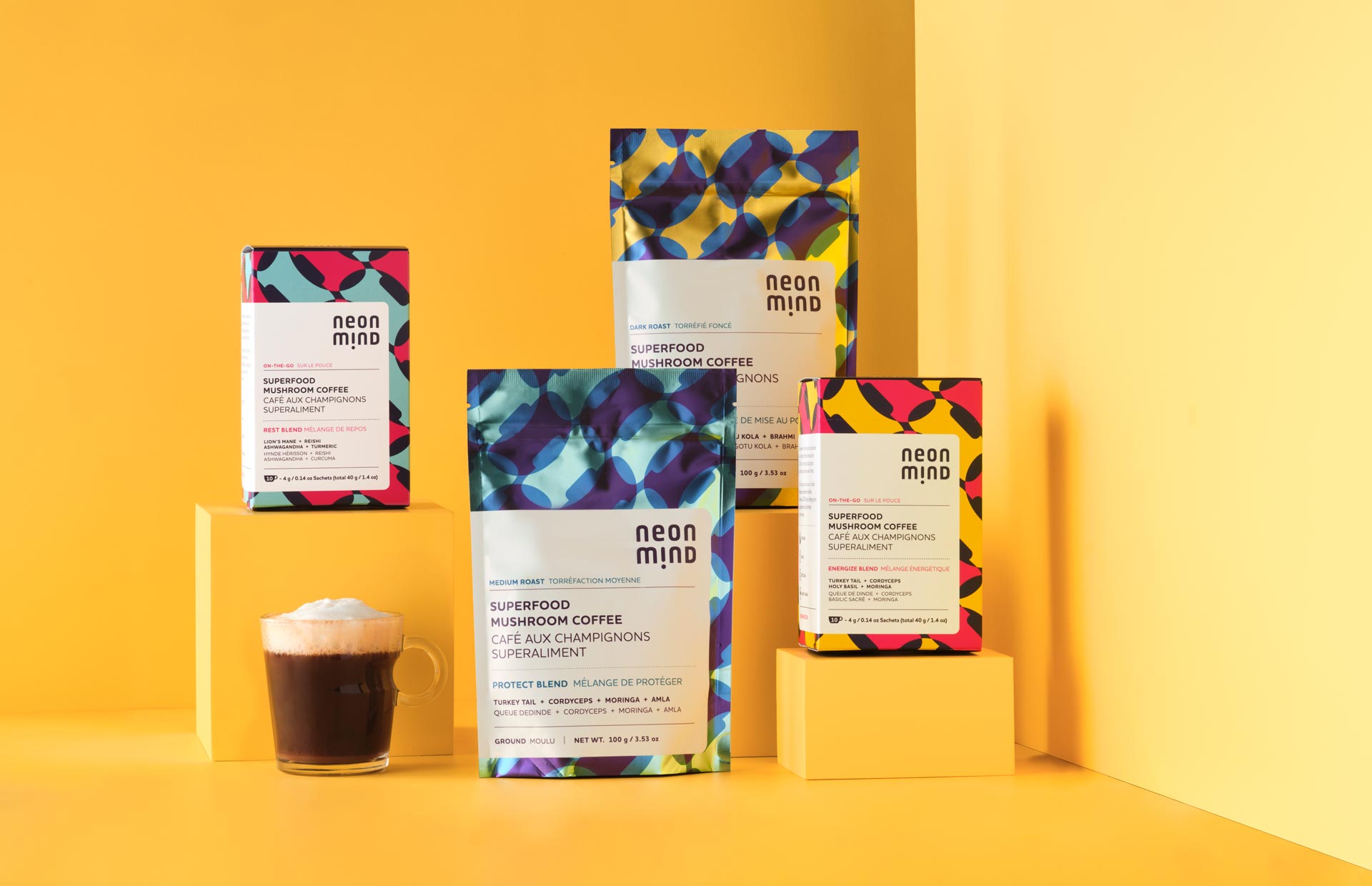
NeonMind was created to introduce an Ayurvedic-inspired mushroom coffee to the niche commercial audience who enjoy mushroom infused coffees. Four flavours all designed with specific effects in mind. Our task was to create something that stood out on the shelf from a field of earth-tones and truly capture the essence of the benefits that functional mushrooms can have on the body and mind. The pattern was designed to be both bold in colour and also a bit subtle as it is made of repeating mushrooms.
PROJECT OVERVIEW
What Was Done
Art Direction, Naming, Brand Development, Packaging, E-commerce Website, Social Media
BRAND DEVELOPMENT
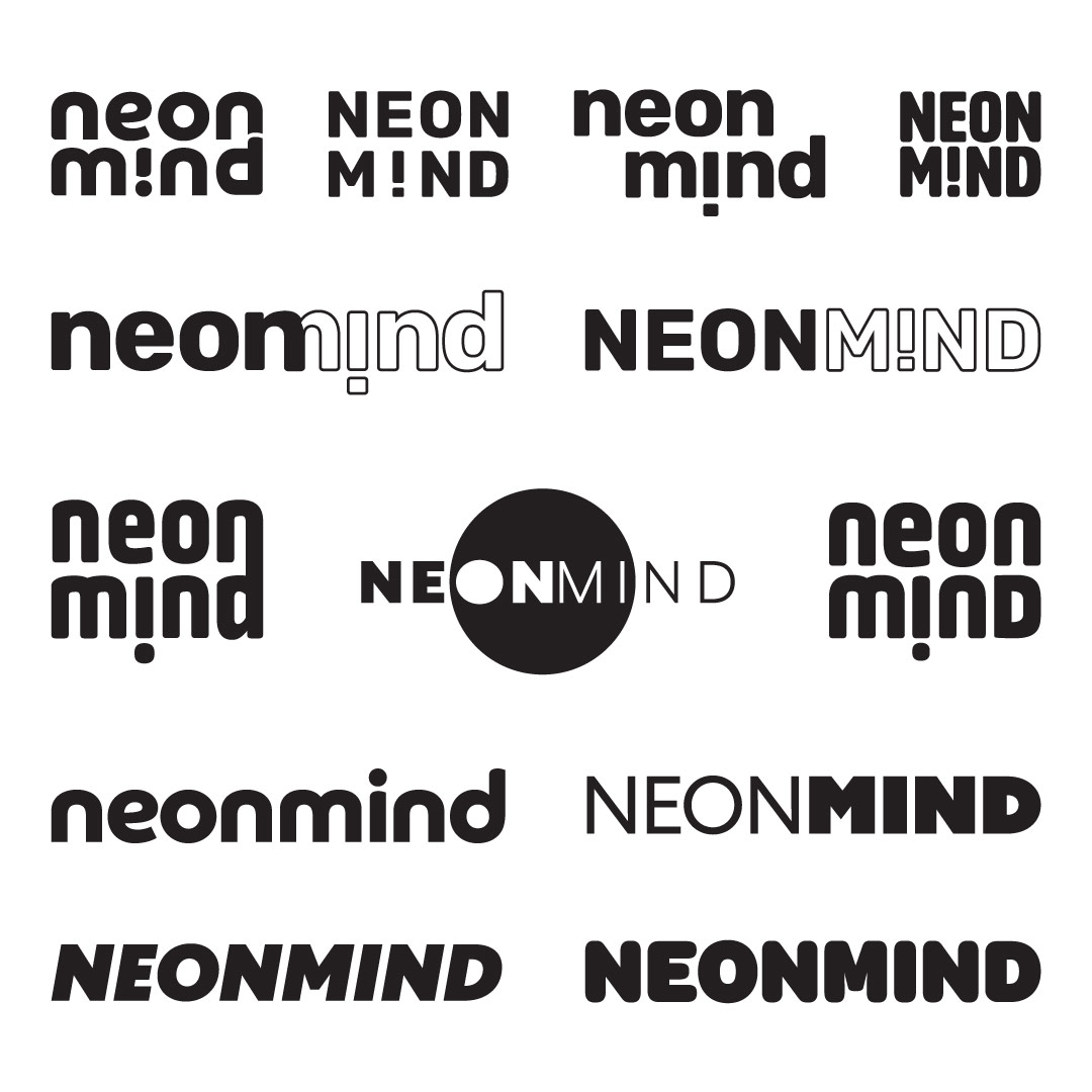
The process for designing a logo/wordmark for NeonMind was interesting because it had to hit two targets as the company is multi-faceted. On one side we created mushroom coffees to enhance aspects of a coffee consumers life, on the other side, clinical research was underway to unlock how psilocybin could be utilized to help treat obesity and trauma. The logo needed to strike the balance between being professionally corporate and also not look out of place on food packaging.
FINAL WORDMARK
& LOGO
The final logo has two versions, the primary stacked version and a horizontal version for some digital applications. Balancing corporate with food was difficult, but a customized clean sans serif with an exclamation mark replacing the i did the trick for us. Our motion graphics designer created this very vibrant logo reveal.

